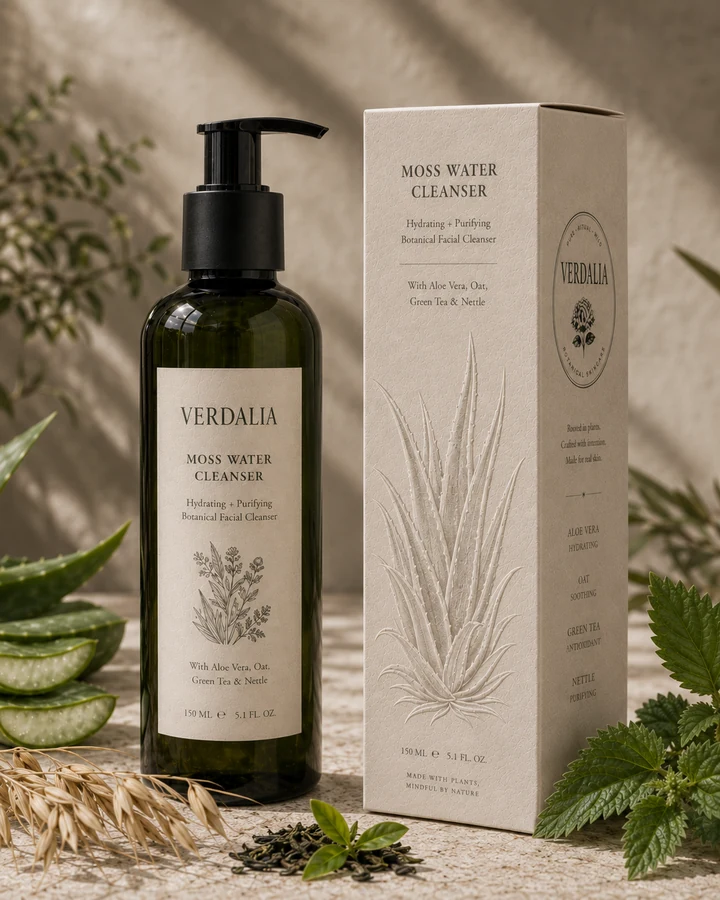
Moss Water Cleanser
Hydrating · Purifying

Brand identity · Packaging

Botanical skincare · Rooted in ritual, plants and self care
Self-initiated concept
2026
Botanical skincare rooted in ritual, plants and quiet care.
A self-ritualed skincare world where ancient herbarium knowledge meets contemporary editorial design.
Verdalia celebrates the intelligence of plants and the beauty of slow, mindful rituals — mysterious yet gentle, natural yet sophisticated.
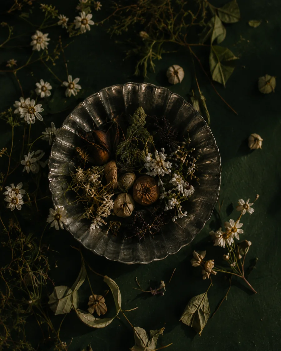
Dark apothecary interiors, preserved plants and misty landscapes define a world that feels ritualistic, tactile and quietly cinematic.
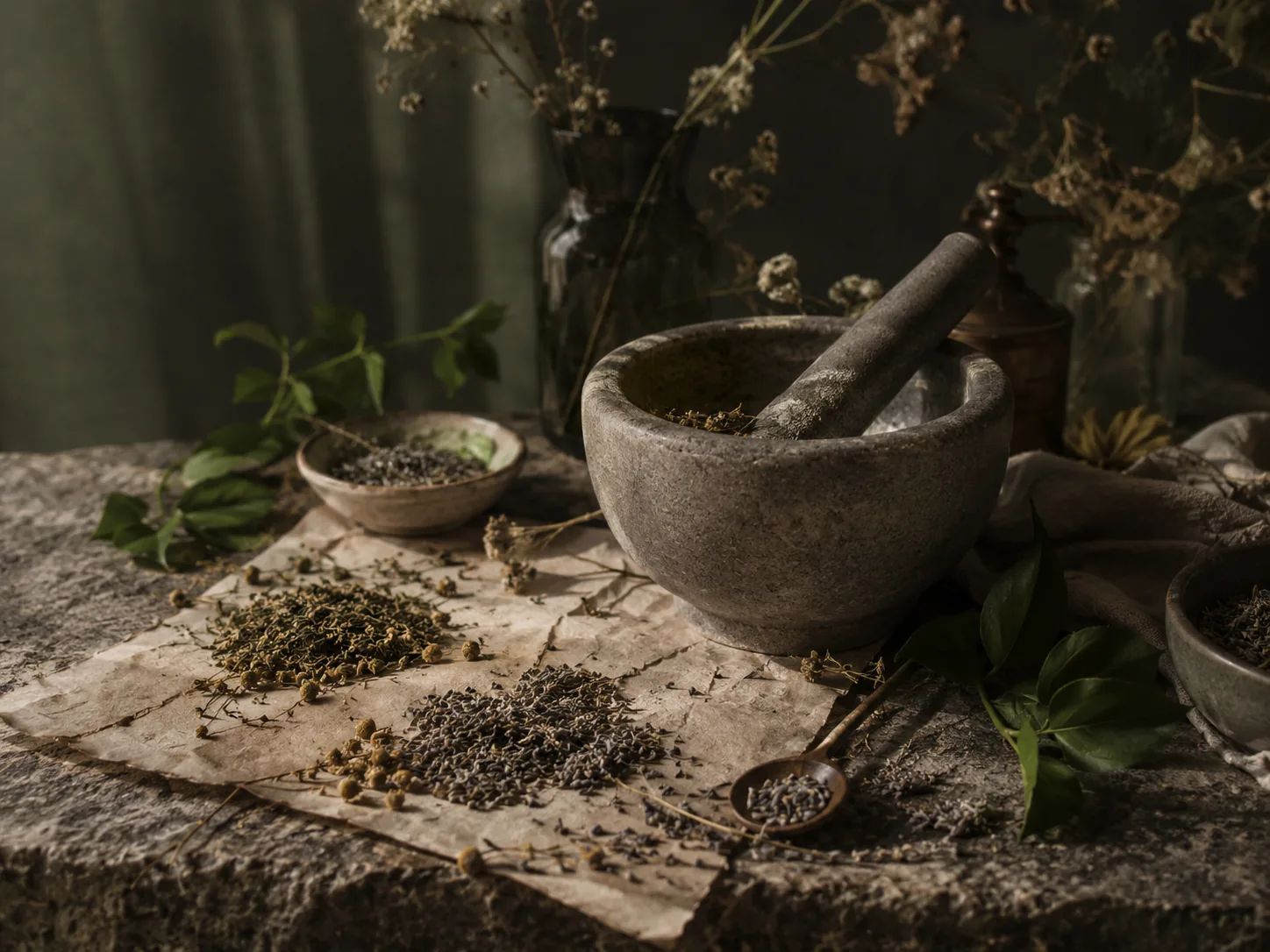
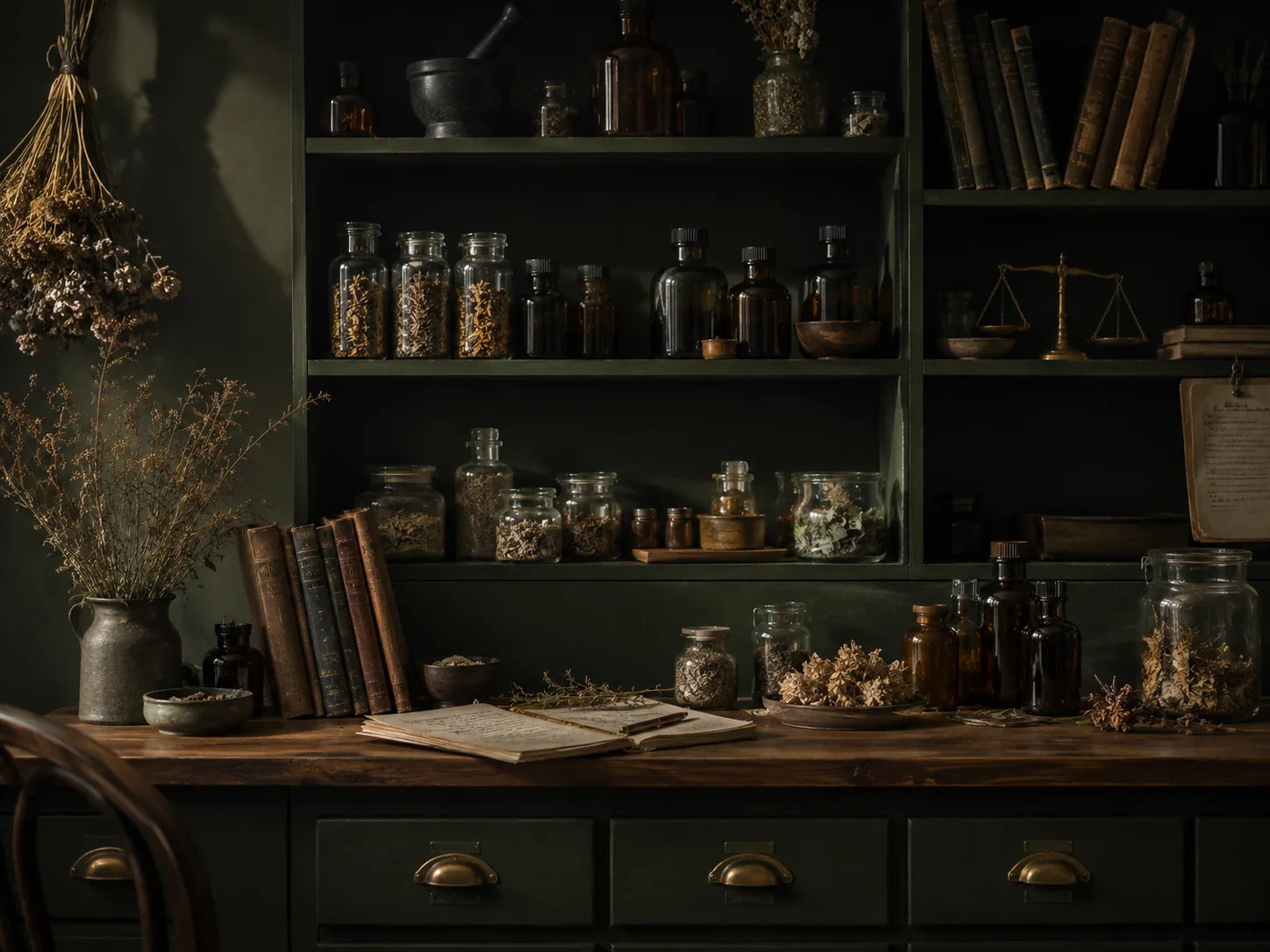
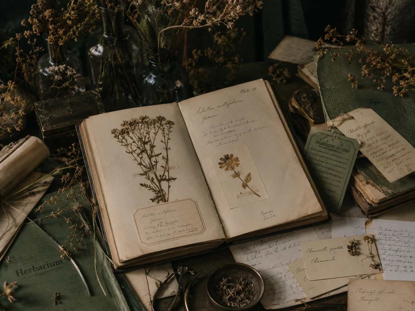
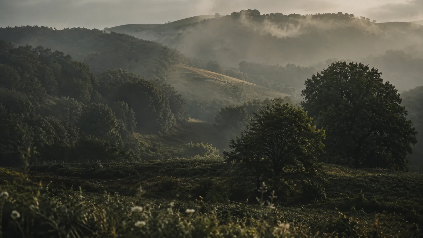
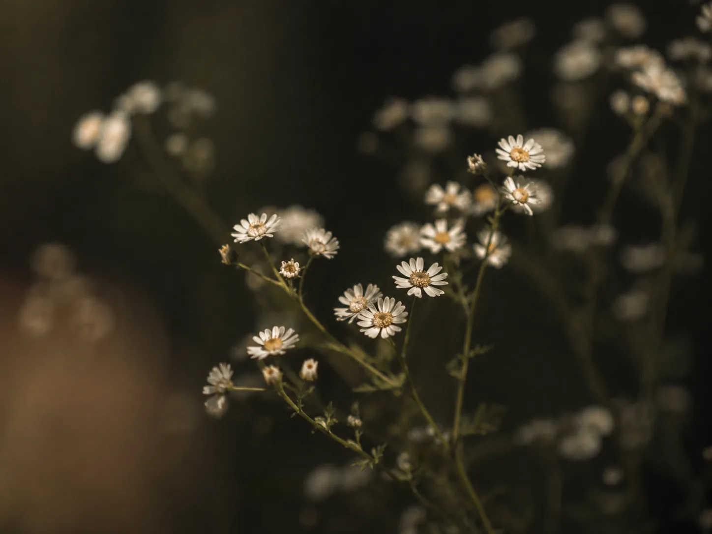
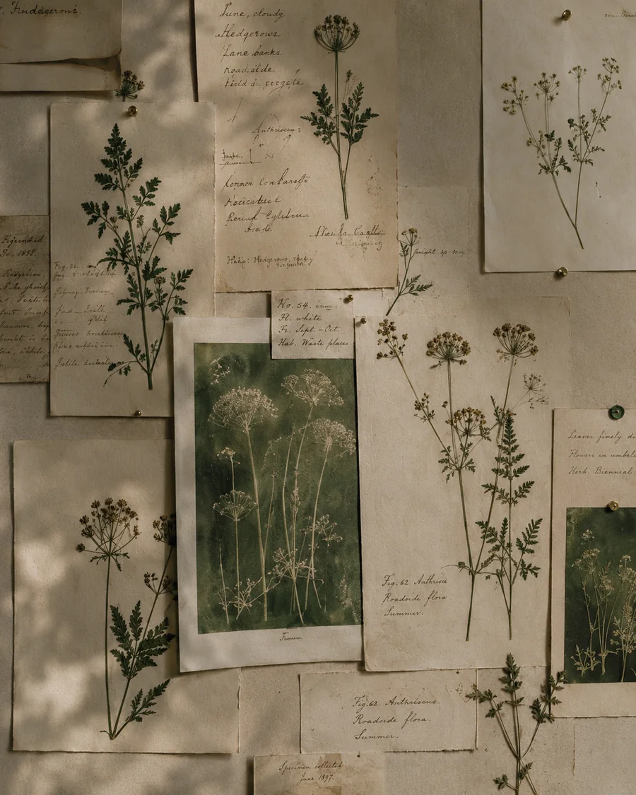
The visual language borrows from botanical archives, old apothecary labels and tactile rituals, then strips them back into a calm, modern system.
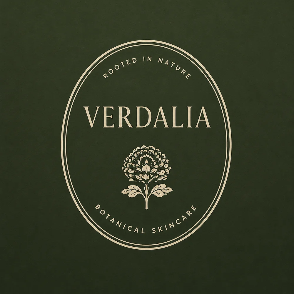
A refined wordmark and a family of botanical symbols create a flexible signature with an archival soul.
The hydrangea becomes Verdalia’s central symbol: delicate enough for editorial use, distinctive enough to live across every physical and digital touchpoint.

A flexible family for packaging, retail, editorial and digital applications.
Earth-led colour and an elegant editorial type system balance botanical warmth with contemporary restraint.
Six foundational colours move between deep apothecary tones and warm paper neutrals. Cormorant Garamond carries the expressive voice; a restrained sans serif supports functional information.
Light 300 · Regular 400 · Light Italic
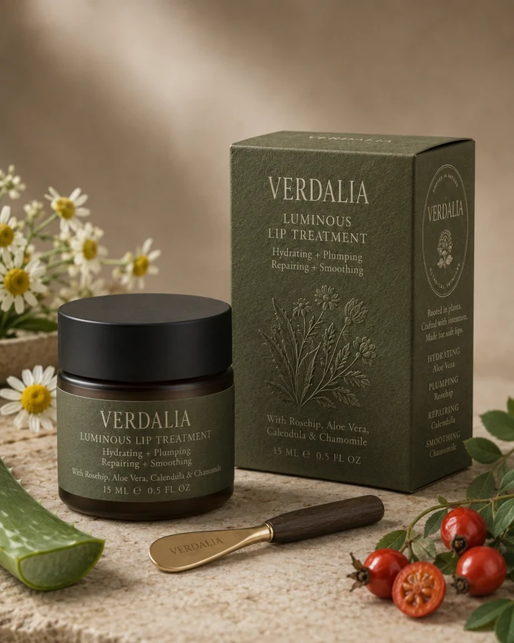
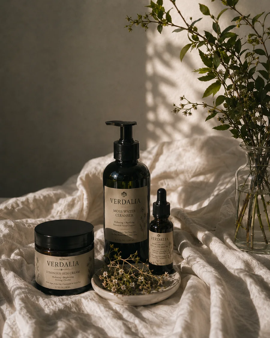
A ritual-led range designed as one cohesive packaging family.
Each format has its own silhouette while sharing the same botanical drawing system, calm hierarchy and material restraint.
Hydrating · Purifying
Hydrating · Repairing
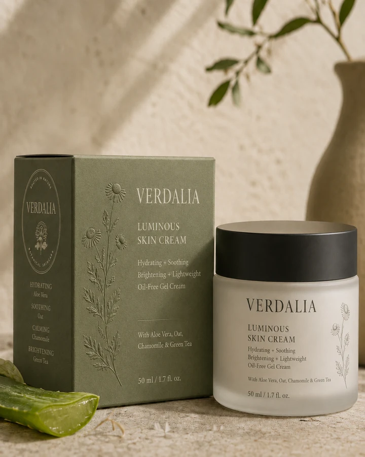
Soothing · Brightening
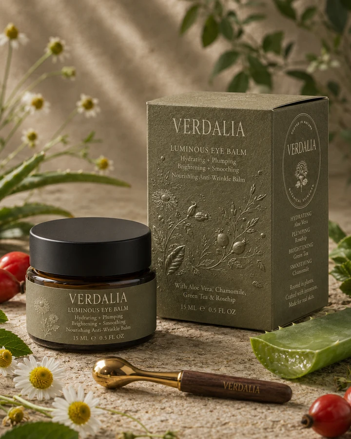
Plumping · Smoothing
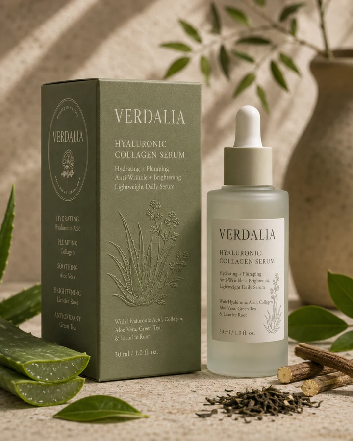
Plumping · Brightening
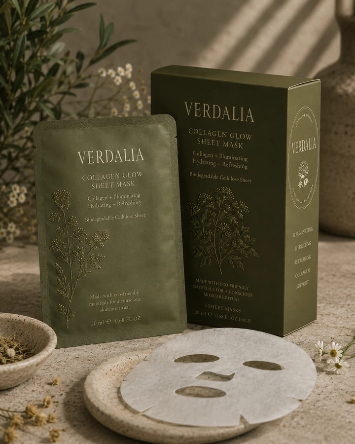
Illuminating · Refreshing
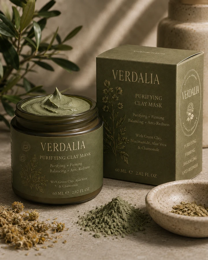
Balancing · Firming
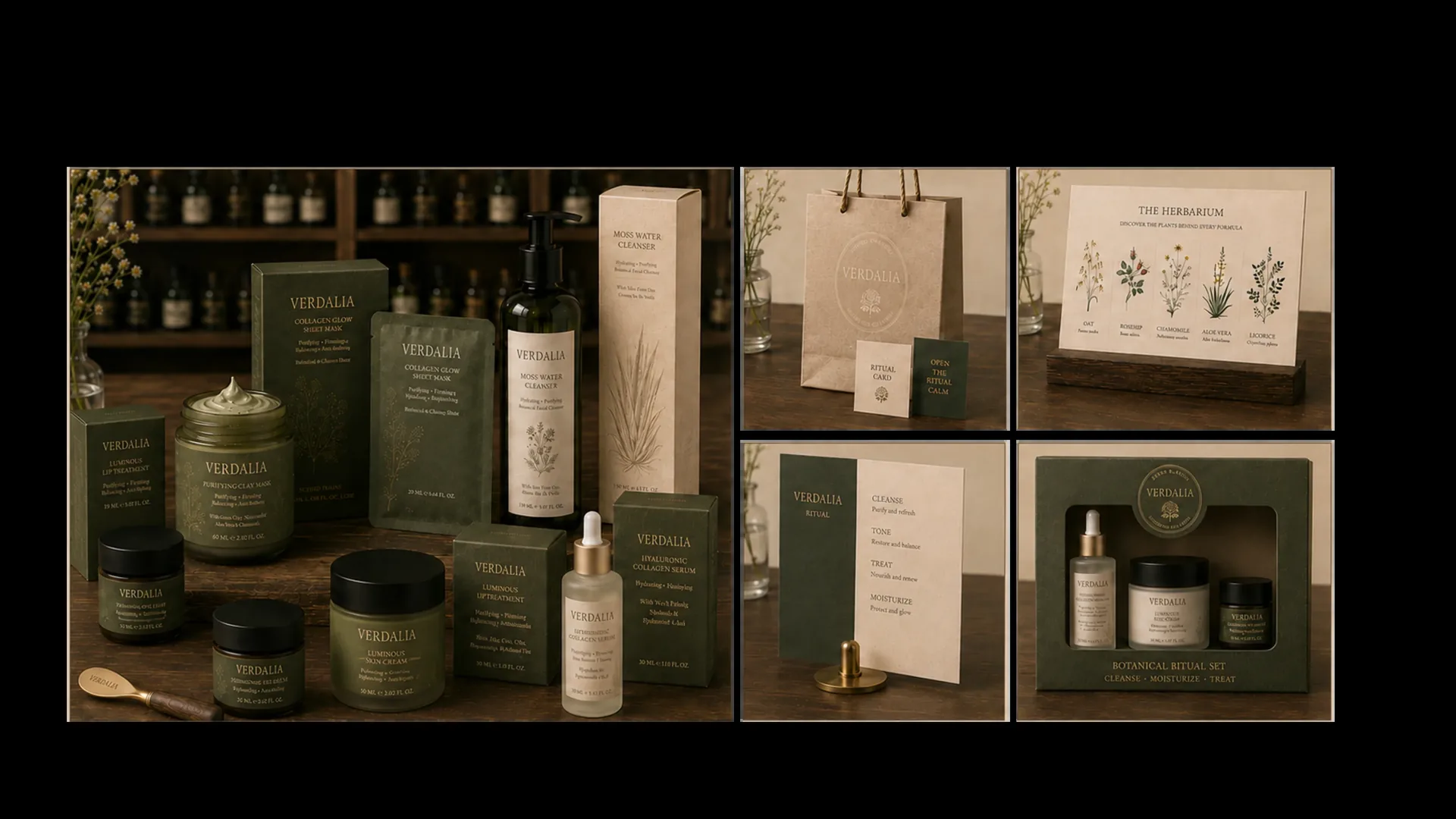
The identity expands into a complete retail world — product displays, ritual cards, shopping bags, discovery sets and herbarium signage.
Every touchpoint carries the same restrained palette, archival typography and tactile material language.
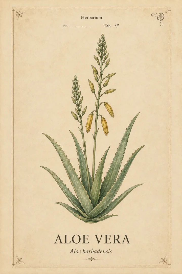
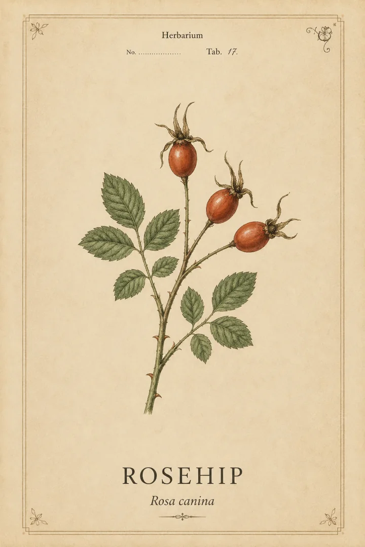
A curated archive of the plants that shape the formulas and the brand’s visual memory.
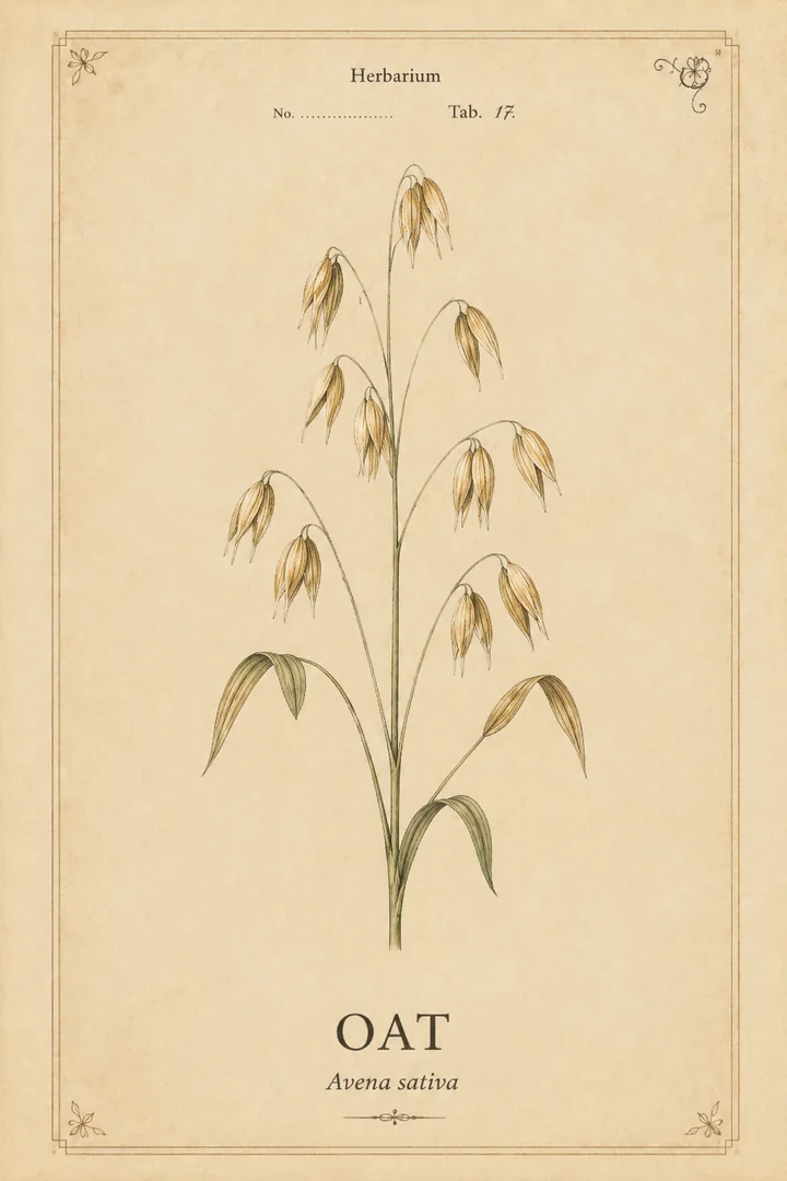
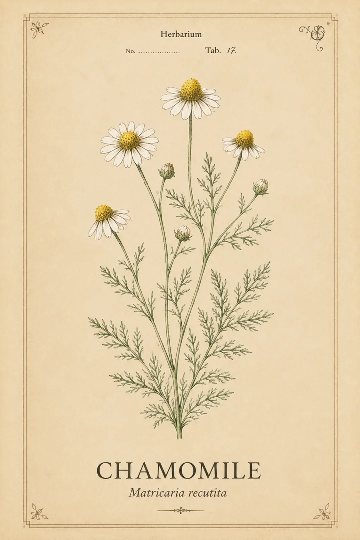
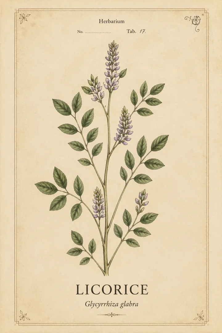
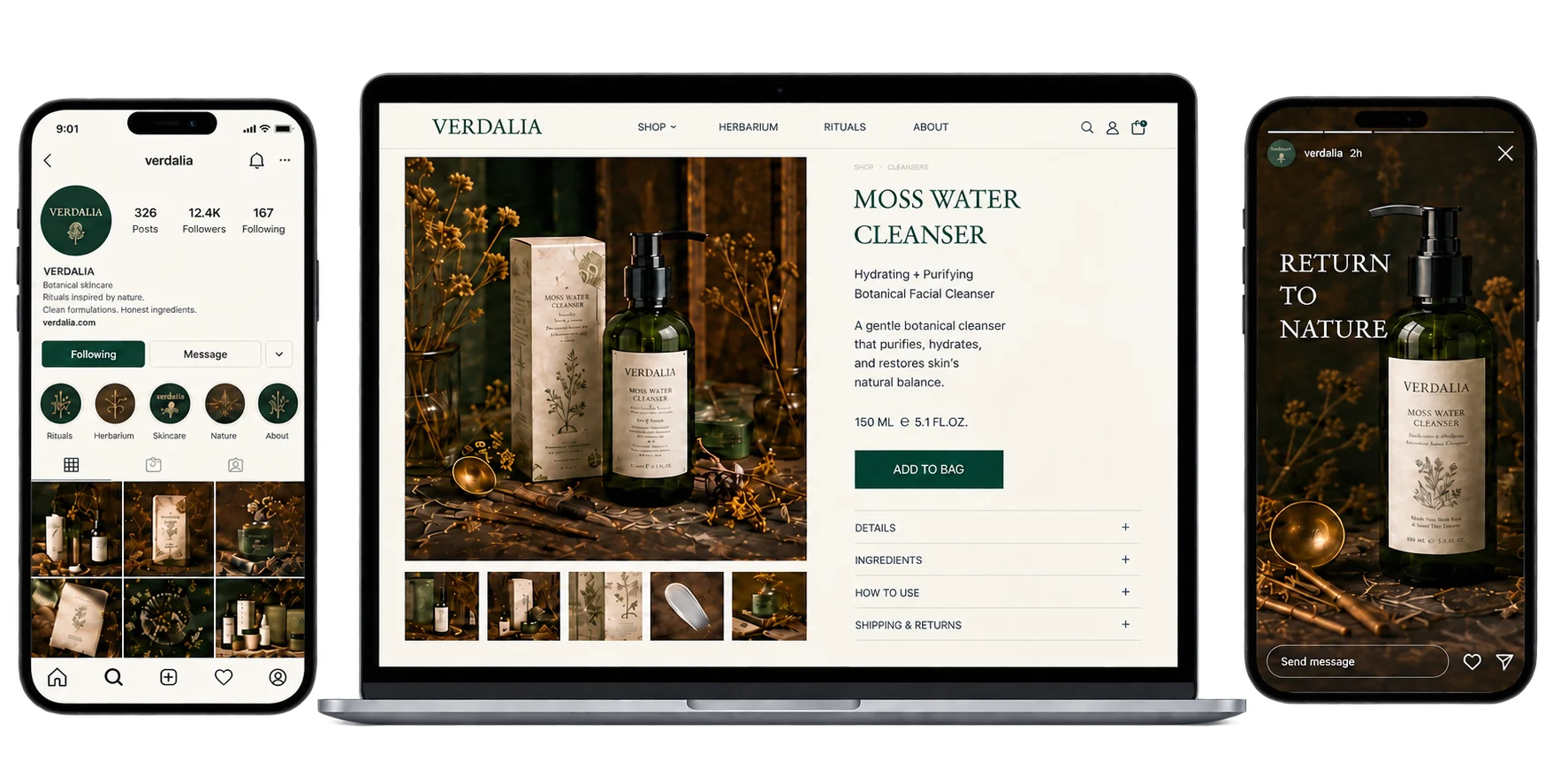
A calm commerce system carries the same sensorial world from product page to social touchpoint.
Editorial pacing, generous ivory space and dark botanical photography turn the digital experience into an extension of the packaging.
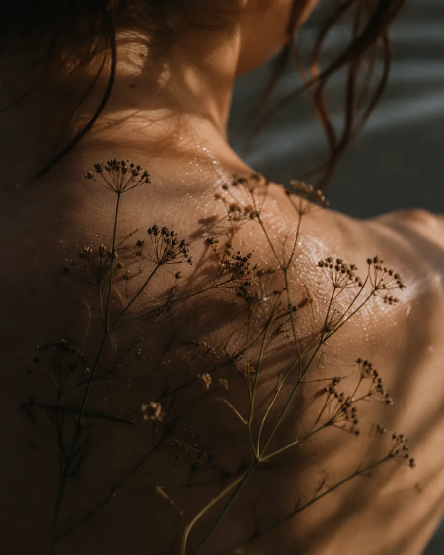
Still life, human touch and herbarium imagery create a warm, tactile campaign with a cinematic pace.
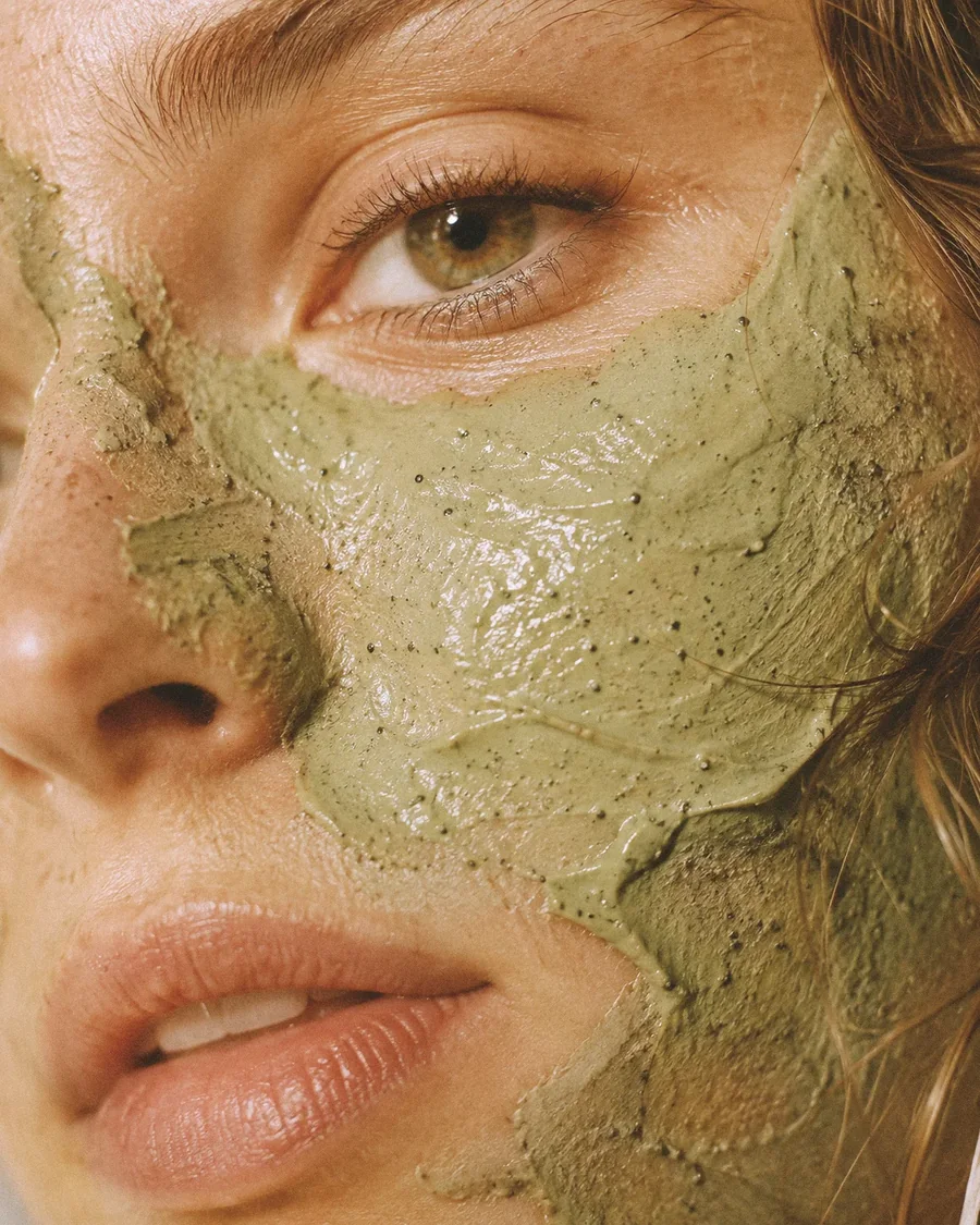
Real texture, diverse beauty and sensorial gestures bring the botanical formulas into contact with living skin.


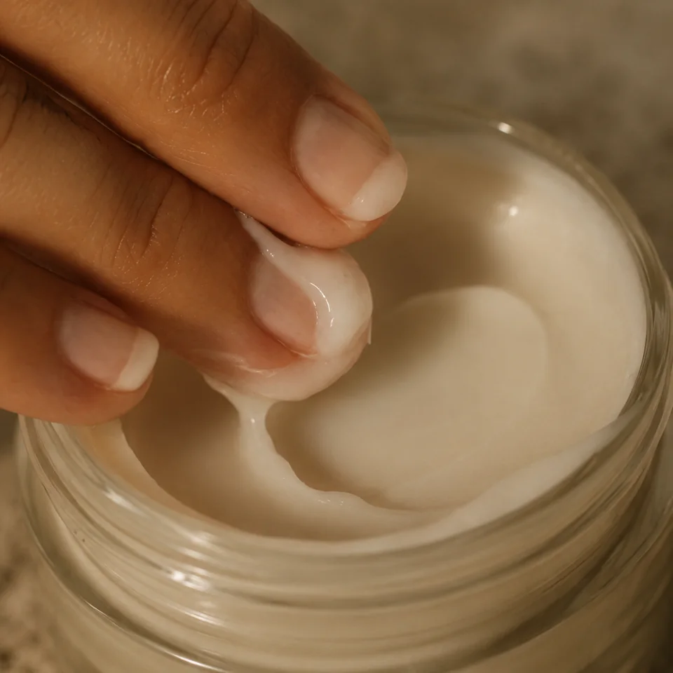
Editorial compositions move between ritual gestures, botanical study and product portraiture — a world that feels lived-in, intimate and enduring.

A coherent visual world where ritual, botanical knowledge and sustainable design become one.